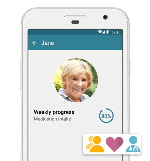
In every aspect of the MyTherapy app, from development to design, accessibility and usability are core considerations. The MyTherapy app exists to ensure patients around the world can consistently take their medication safely and take control of their health. For users to succeed, they should not be limited by a lack of accessibility. That’s why there are a number of features built into the app aiming to ensure its usability for everyone.
Assistive Technologies: Using Voiceover and Talkback to make the visible hearable
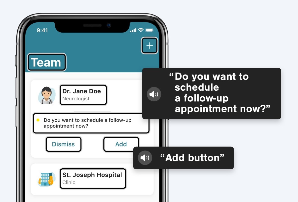
Using native technology on iOS, the MyTherapy app offers users access to the VoiceOver features. This means users with sight loss can tap on buttons, even ones that are an icon without text, and their device will read out its function. Furthermore, MyTherapy assistive technology integration uses hierarchical displays of information, ensuring that the reading order the user hears is one that makes sense. Assistive technology in the MyTherapy app is more than ticking a box, it truly adds value. The MyTherapy app also supports alt text for all images, enabling users with screen readers to hear descriptions of each image. Even for editorial images, this is a quality-of-life improvement that provides a more comfortable experience for visually impaired users.
Another key aspect of catering to all users is implementing visual and haptic feedback. By making sure that pressed buttons look different from idle buttons, users can clearly understand what is being tapped on. Features such as date pickers provide haptic feedback as users scroll through options. Implementing features such as haptic feedback provides users with the ability to leverage senses other than vision to get maximum functionality out of the MyTherapy app. For many, these features are little more than an added convenience, but for others, they are critical to utilizing the full capabilities of the app.
Visual Aid: Good Design works independent of visual impairments
The MyTherapy app has a wide range of users, including users aged 60 and over, with many of them utilizing adjusted text sizes on their devices. To ensure users are able to use the app just as easily as they would anything else on their phone, dynamic text sizes are reflected across the app. It’s important that users can take control of their health seamlessly and aren’t left navigating a difficult-to-use app to set up their medication reminders.
By adhering to standards set by WCAG (Web Content Accessibility Guidelines), every UI element is built with color contrast and visibility as a key concern, especially key conveyors of information like text. Furthermore, color is never used as a sole conveyor of information. Icons, labels, and patterns all provide users alternate means of receiving important information. If there is a point with lower than desirable contrast, the same content will always be accessible elsewhere within the app.
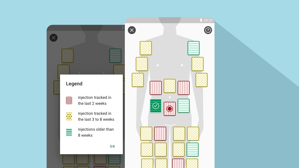
It’s becoming a common theme in this article, but once again, the importance of “minor” features can be massive when it comes to accessibility. As with haptic feedback, the visual hierarchy can have a subtle effect for many users but makes the app far more accessible for other users. The combinations of text color, images, and white spaces greatly influence which items stand out on a screen, and in turn, increase usability.
The MyTherapy app is designed with details in mind, down to the accessibility of animations. To ensure usability for all users, animations have longer than normal delays, and slowed movements.
Thanks to the efforts of tech companies like Apple, assistive technologies are becoming more and more mainstream. By considering accessibility through the development and design process, apps can integrate with features like VoiceOver as well as building their own app-specific features in as well. The MyTherapy app was built on exactly these principles and is giving people around the world the necessary tools to take control of their health, regardless of their accessibility needs.
Here are some other articles we think you might be interested in:
Interview: The Unique Challenges of UX Design for Patient-Facing Apps
The 19 Best Apps for Seniors - From Accessibility to Entertainment